Front-Lit vs. Halo-Lit Channel Letters: Which Look Fits Your Business?
The direction of light affects how customers see your storefront’s illuminated lettering. It also determines how your logo stands out against the building and how the sign complements your property's overall appearance. When comparing front-lit vs. halo-lit channel letters, the main difference is where this light appears.
Learn more ↓Tell us about your project.
The direction of light affects how customers see your storefront’s illuminated lettering. It also determines how your logo stands out against the building and how the sign complements your property's overall appearance. When comparing front-lit vs. halo-lit channel letters, the main difference is where this light appears.
Front-lit letters illuminate through their faces, creating a direct, visible display. Halo-lit letters project light behind the letters onto the mounting surface, producing a softer glow around their edges. Your brand identity, building finish, viewing distance, surrounding lighting, and installation requirements all influence which option makes sense for your business.
This article will help you understand the factors involved in choosing an illuminated sign that looks appropriate during the day and at night.
How Front-Lit Channel Letters Look and Work
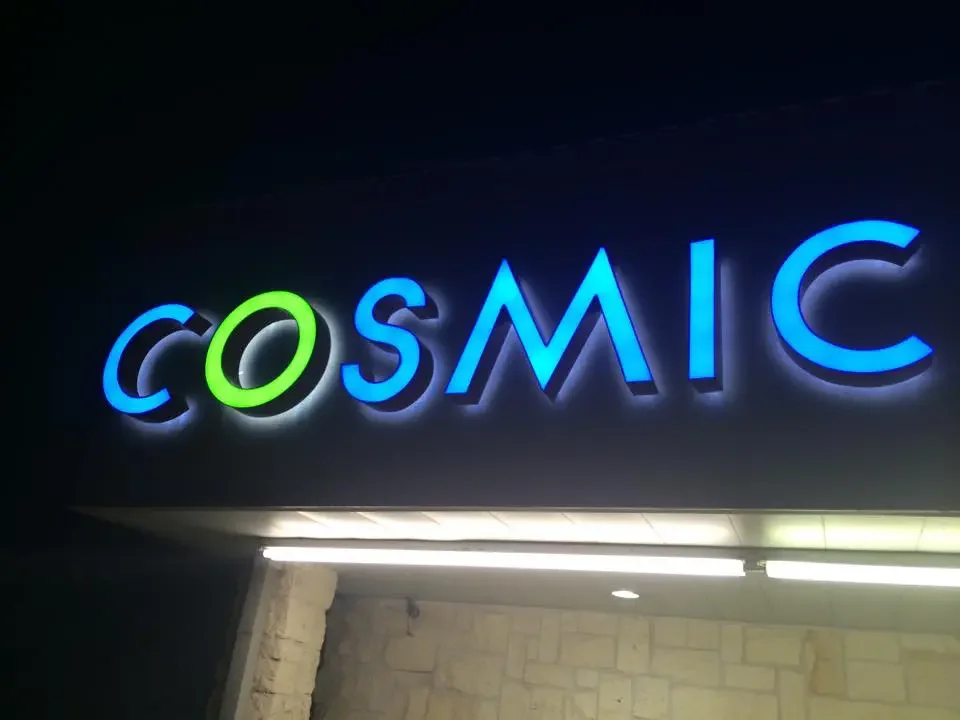
In a front-lit letter, illumination comes forward through the face. The construction typically involves three parts: a face that transmits light, a trim that frames it, and a cabinet that holds the internal components. The letter's face delivers the visual message, and the trim defines its outline. The materials, colors, and construction depend on the design.
Because the face glows, front-lit lettering reads as bold and direct, making the brand’s logo or name the brightest element on the facade. This format is good when businesses want prominent storefront signage, maintain brand consistency, support quick recognition, or complement an active retail setting.
Another important consideration is the sign band, the area of a building facade designated for signage. It is positioned to be seen from a distance or at an angle. A light, dark, or patterned background can change how the illuminated letters appear. The face color, surrounding trim, and letter spacing should work together.
Businesses evaluating different channel letter sign options should consider the overall design rather than the illumination.
How Halo-Lit (Reverse-Lit) Channel Letters Look and Work
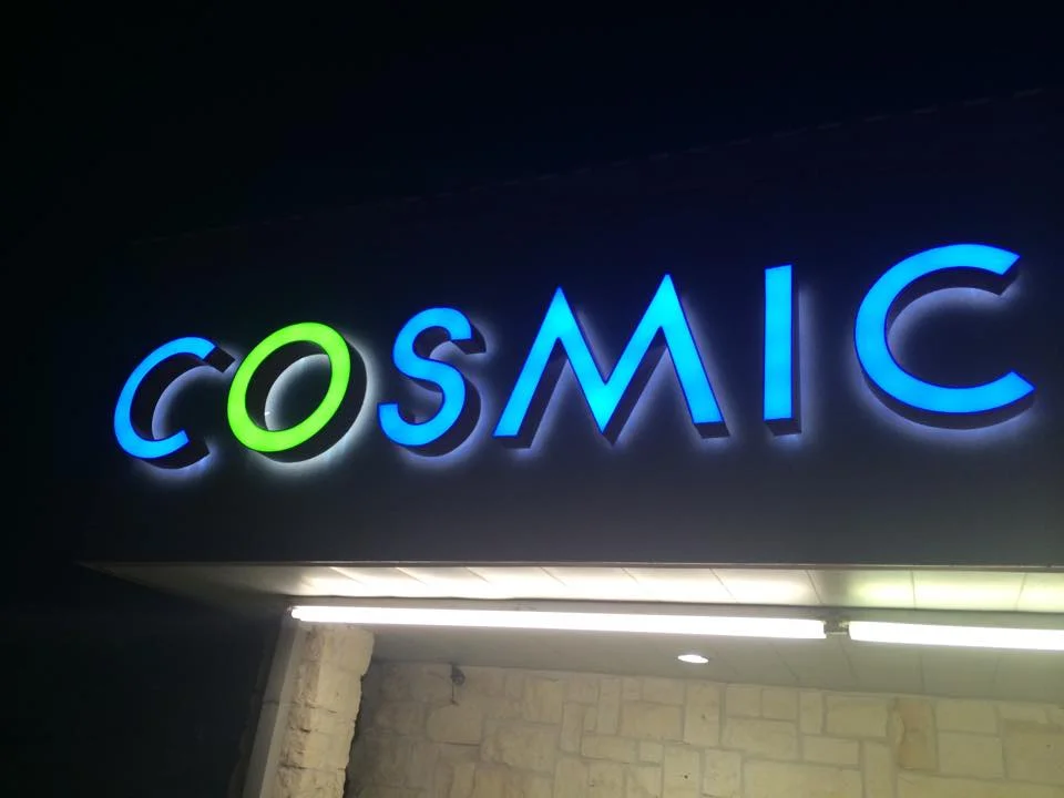
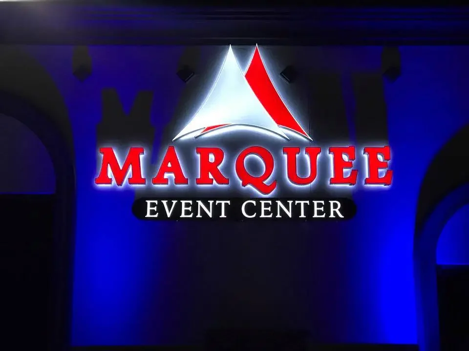
Halo-lit lettering is also commonly called reverse-lit channel lettering because the light is directed toward the rear rather than through the front. The light is directed backward onto the mounting plane, spilling across the wall and creating a glow outlining each letter. The letters often read as silhouettes against that glow rather than as glowing objects themselves.
This requires the letters to sit away from the wall, so stand-off mounting is part of the concept: the letterforms are held off the surface, leaving room for light to travel behind them and land on the wall.
In halo-lit lettering designs, the wall is part of the sign. Its color and finish influence how the glow appears. A smooth, lighter surface may carry the halo more evenly; a dark or heavily textured facade may absorb it or break it into patches. On textured or dark masonry, halo effects can vary considerably. This is a design consideration to evaluate on your actual building.
Side-by-Side: Appearance, Contrast and Brand Fit
Both channel letter styles offer illuminated signage, but they communicate through different visual effects. Comparing their practical considerations can help you identify which direction better supports your business.
Consideration
Front-Lit Channel Letters
Halo-Lit Channel Letters
Primary light effect
Illumination through the letter faces
Glow projected onto the surface behind the letters
Overall appearance
Direct and prominent
Subtle and dimensional
Daytime appearance
Letter faces, colors, and shapes remain important
Letter shapes, finishes, and mounting details influence the look
Contrast
Depends on face color, background, and surrounding light
Depends on letter contrast and the mounting surface's response to light
Brand fit
May suit bold, easily recognizable storefront identities
May suit brands seeking a restrained, architectural appearance
Facade considerations
The sign band should support clear letter visibility
The wall finish and mounting arrangement influence the halo
Installation planning
Requires appropriate mounting and electrical planning
Requires appropriate mounting, rear-light clearance, and electrical planning
Maintenance access
Depends on the construction and installation arrangement
Depends on the construction and installation arrangement
Which Works Better for Your Building?
The right choice often becomes clearer when you consider the building, its surroundings, and the way customers approach it. Let’s look at a few hypothetical situations.
Busy Retail Corridors
A business among several neighboring storefronts may need a sign that communicates its name clearly from the sidewalk or parking area. Front-lit letters are worth considering here because direct visibility and recognizable brand colors are priorities. The surrounding signs, available sign space, and viewing angles should also influence the decision.
Professional Office Facades
A professional office may benefit from an appearance that complements the building's architecture. Halo-lit letters may be a suitable option, offering dimensional lettering and a controlled glow against the facade. Front-lit letters can also work well if the brand calls for a more direct, prominent presentation. The choice should reflect the organization's identity.
Dark Masonry and Textured Walls
Dark brick, stone, and other textured finishes require careful evaluation, especially when considering halo lighting. A dark wall may absorb light, while an uneven surface can create an irregular glow. Front-lit letters may provide a more directly illuminated surface in this situation, but also consider the face color and overall contrast.
Light, Smooth Sign Bands
A light-colored, relatively smooth sign band may provide a useful backdrop for halo-lit lettering. Light reflecting onto the surface can create a visible outline around the letters. However, the final effect depends on the distance between the letters and the wall, the surrounding light, and the mounting surface finish.
Multi-Tenant Commercial Properties
For properties with multiple tenants, consistency across storefronts can be just as important as an individual business's branding goals. However, property managers and tenants may need to work within established sign criteria, such as letter dimensions, placement, colors, illumination, and the overall appearance of the storefront. Before selecting a lighting style, review the landlord's requirements and existing electrical access.
Can the Two Lighting Styles Be Combined?
A front-and-halo approach results in illuminated faces with light projected behind the letters. This is a possible design choice worth discussing during planning when a business wants the message to glow with the wall carrying a secondary glow. The result may provide a more layered appearance, but it also introduces additional design considerations.
For instance, the face illumination and rear glow must work together without the lettering seeming cluttered. Brand colors, letter shapes, mounting conditions, and the surrounding wall’s appearance all affect the result. A combined approach may also require more detailed planning for construction, electrical integration, mounting, and future maintenance.
Before choosing this style, consider whether the added visual effect serves a clear purpose. Review the proposed design with a signage professional to determine what is practical for your building and requirements.
What to Review Before Requesting a Sign Design
Before moving forward with illuminated channel letters, use this checklist to gather all available information and prepare for a consultation:
• Logo or artwork files: production-ready if available.
• Building and sign-band photos: including the area where the sign will mount.
• Mounting conditions: wall type, surface, and any existing signage.
• Viewing distances and primary approach angles.
• Property rules and requirements: landlord, local approval, or design-review requirements.
• Electrical access information.
• Desired night and day appearance: which look you want at noon, and which in dim lighting.
• Maintenance considerations: how the sign can be accessed for inspection and servicing
FAQs
Is halo-lit the same as backlit?
In practice, yes. Halo-lit and back-lit both describe light projected behind the letters onto the mounting surface, which is the same as reverse-lit in this context. The terminology is often used interchangeably, but discuss the particular details with the signage company.
Does a dark wall affect the effect?
The wall is the reflective surface, so its color and finish matter. Darker or textured facades may absorb the glow or break it up, while smoother, lighter surfaces may display it more evenly. Evaluate this on your building before finalizing the design.
Can either style work on a raceway?
Raceway mounting is common for channel letters and can work with either illumination style. Whether it suits your facade is a design decision based on the building.
Which is more readable in daylight?
Both halo-lit and front-lit styles remain readable unlit, though they read differently. Front-lit letters show a defined face, while halo-lit letters often read through depth and edge. Daylight legibility depends heavily on contrast between lettering and wall.
Are illumination options restricted?
Possibly. Property rules or local review may govern illumination type, placement, and brightness. Confirm the exact requirements with the relevant authority before finalizing your design.
What affects the quote?
Artwork readiness, facade and mounting conditions, electrical access, letter size and quantity, viewing distances, and the illumination style you choose all affect the quote. Each factor changes the scope of work, so quotes should be prepared per project rather than from a general price list.
Explore Channel Letter Options
Front-lit letters may suit businesses that want their illuminated lettering to carry the message directly. Halo-lit letters may be a better fit when the design requires a glow that highlights the letters and the facade. In either case, the building finish, brand identity, viewing conditions, and installation requirements should guide the decision.
Covenant Signs & Graphics helps businesses explore custom signage options for their properties. Ready to plan your sign? Request a quote to discuss your building, branding goals, and preferred lighting effect.