Customers approach a storefront from different angles and distances. A driver may notice the building's main sign; a pedestrian may read a projecting sign or window information first. Each format supports a different part of that journey.
Storefront signs work in layers: building identification, pedestrian visibility, entrance information, and occasional promotions. Compare formats by approach, lighting, property conditions, and the message customers need to read.
This guide compares six formats and the decisions that matter most. See our storefront signs service page for broader project planning.
Channel Letters
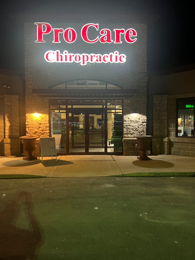
Channel letters are each a 3D shape created as a single channel letter and then attached directly to a wall or a raceway. They glow with your name, and many are illuminated from the inside, so there is no box behind your name to add to your appearance. The result is a clean look with the lettering and logo appearing to be part of the building.
Hence, you find them at retail fronts and in shopping malls. They perform well in the dark and work for companies with a name or logo that can still be read when converted to letter shapes. The downside is fabrication, where each letter is a piece to be fabricated, and your wall needs to be able to handle it. If this is on your shortlist, you can read more about channel letters and where they fit on our page dedicated to channel letters.
Cabinet Signs
A cabinet sign is a framed sign that has a flat front and displays your graphics. The majority of them have light sources on the interior, and that causes the panel to have an even light intensity. When you need some space for a longer name, a tagline, a phone number, or a few lines of services, cabinets are useful since everything is on one surface.
They can be easily identified and read, which is a great plus when reading at a fast pace. However, they can be weighty in a dense layout, so it is better to be conservative in creating the design. Generally, a simple face with strong contrast will suffice. It's possible to view our approach to them on our cabinet signs page.
Dimensional Letters
The dimensional letters are cut from solid material and stand slightly out of the wall. Depending on the design, they may be mounted individually or with supporting hardware. Their depth, shadows, and finish create a dimensional effect compared with flat graphics.
Dimensional letters can suit professional offices, boutiques, clinics, and businesses seeking a more understated appearance. The material in a sign alters the character of the sign. Brushed metal, painted aluminum, and cut acrylic are all different when it comes to light. Remember, if it is not lit, then unlit letters can fade into the building after dark if you aren't planning for lights. Our dimensional letters page discusses the choices.
Awning Signs
The awning serves two purposes. It protects your entrance and windows from the outside and provides you with a place for your name or logo. This is perfect for cafes, salons, small shops, and places where people can simply stroll up to the door.
Awnings are particularly visible to pedestrians approaching the storefront. Their materials and support should suit the building and site exposure. They also enhance the appearance with color and texture to a basic facade. Exposed to the elements, material selection is important, particularly in the Wisconsin climate. Our awning signs page delves into the specifics.
Blade Signs
Most wall signs have a problem: They are not very accessible from the side. The most unobtrusive sign on the façade will not be seen until it is directly in front of you by someone walking down the sidewalk toward your shop.
A blade sign resolves this issue. It extends out of the building at right angles; people can see it from either approach long before they get to you. It's a great option in pedestrian-friendly streets and on the central streets of dense areas. Regulations typically exist on the size and projection over a public sidewalk, so be sure to check local rules early. There is more information on our blade signs page.
Window Graphics
Window graphics are vinyl letters, logos, and films directly applied to the window. They're the ones that people read first up close from your storefront: Your hours, your phone number, your services, a quick line about what you do. There is also some film that provides privacy but lets light through.
Window graphics may be easier to update than a large sign, depending on material and installation. You are not replacing a large sign if your hours vary or if you wish to advertise something new. They're best used in conjunction with another sign and not as the sole sign, as they are mostly seen up close. View our window graphics page to see what can be done!
How to Choose
If you're wondering how to choose a storefront sign, it's important to think about the building and the people, not the sign itself. These are the questions that generally determine it:
Your facade: What is the available wall space, and what is the condition of the wall? Certain mounting options require a solid surface, while certain facades are overrun by windows, doors, or trim.
How people approach: When a lot of customers drive by, you must have something that can be seen from afar. For formats that are closer, such as blades, awnings, and window graphics, more importance is placed on them if they are walked up to.
Landlord rules: There are many leases that specify what is allowed, such as size, placement, and lighting. Don't fall in love with a design without reading it first.
Day and night: Do you have open evening(s)? If that's the case, it should be as much a conversation with them, instead of an afterthought.
Architecture: There are different answers to the question of a sleek modern frontage and a historic brick building.
Budget and permits: Both modify what is realistic. Check the permits for your city and site since they vary by location and type of site.
Some storefronts combine several sign formats for different viewing situations. For retail storefront sign types, a typical combination could be channel letters or cabinet signage for the primary name, a blade sign to attract foot traffic, and window graphics for hours & details. Each piece is going to a different distance, and combined they will address the distance of your customers.
This is the package thinking we use at Covenant Signs & Graphics. We have a team in Green Bay that designs, makes, and installs the piece, so we plan it all together rather than ordering it piece by piece. It is a process that begins with consultation and ends with the sign design, manufacture, installation, and continued service. Materials are selected for use based on where the sign will be located, its intended purpose, style, and the available budget (and, if applicable, Wisconsin weather).
FAQs
Which storefront sign is most visible from the road?
When owners inquire about the most effective way to have the best storefront signs for business from the road, it all comes down to the store's location. Generally, bigger, lit-up wall signage like letters or cabinet signage will show, particularly when it comes to the opposite side of the road to oncoming traffic. Placement, letter height, contrast, and distance of your building from the back all come into play. Awnings, window graphics, and similar pedestrian-level media are designed for a different audience.
Which storefront signs can be illuminated?
The most popular channel letters and cabinet signs to light are the ones that people are most familiar with. Some blade signs and awnings can be lit too, as can be dimensional letters — for example, with backlighting or external lighting. Typically, window graphics are not illuminated. The possibilities depend on design and building and, for this reason, should be discussed early in the process.
Can I combine more than one sign type?
Yes, and most businesses do. It's often used in combination with a blade sign and window graphics, as they have different reach. Coordinate the typography, branding, and information hierarchy so the signs work as one system.
Do storefront signs require landlord or city approval?
Yes, often, to one or both. Size, placement, and lighting restrictions might be imposed by your lease, and a permit may be needed by your city. You should always check with your landlord and local authority for your address, as requirements vary by jurisdiction. If you don't know what to research during your consultation, we can discuss it with you.
When you're still deliberating, the next best step is to discuss it with someone. Covenant Signs & Graphics provides a free consultation and quote for signage initiatives in the Northeast Wisconsin area in Green Bay, Appleton, Two Rivers, and beyond. Request a project quote, or call (920) 949-7089. You can also find us at 2200 Velp Ave., Green Bay, WI 54303.